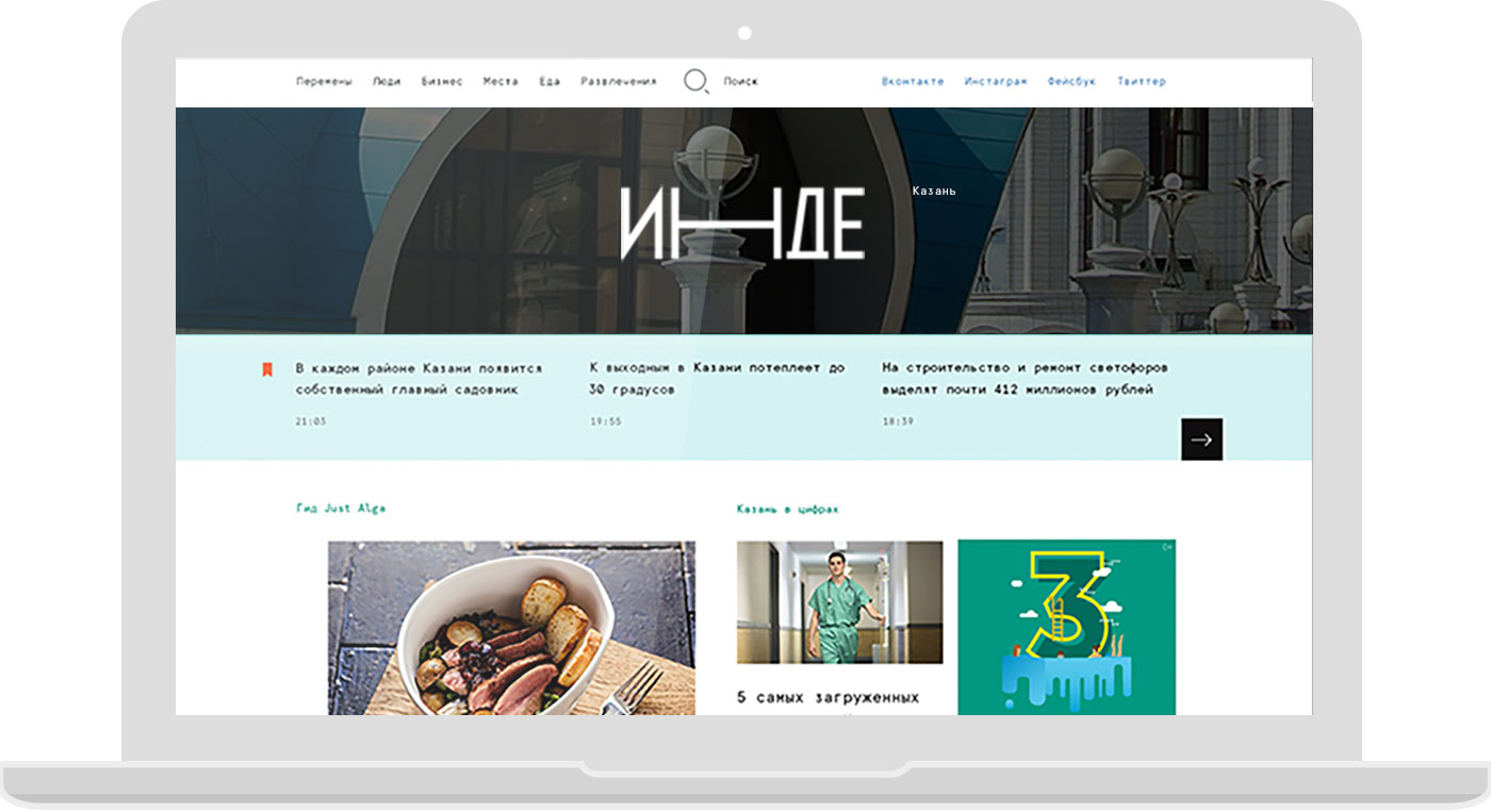
The objective was to launch hyperlocal new media about positive changes in Kazan and other cities of Tatarstan Republic in the shortest time possible.
Based on the experience gained from working with dozens of media companies, we have developed an optimal solution for our own online media. This solution have formed the basis for a number of our projects and became the foundation of Inde. Its main advantages include reduced development time, budget optimization, and availability of all the basic features required for a new editorial office.
Monotype sets the mood
Monospaced font became the core of the visual language of the new media. It sets the pace for the grid and adds a touch of uniqueness and freshness to the usual look of a media site. From the moment of the project launch the font became a part of its corporate identity.
![]()


When designing a media site we always think about such aspects as increasing the number of readers, building trust and retaining users. Our graphic solutions are based on knowing the history of typography and arts, experience with classic and new media, and knowing what is behind the scenes of an editorial office. All of this helps us create solutions that won’t get outdated for a long time.
Go Mobile or Die
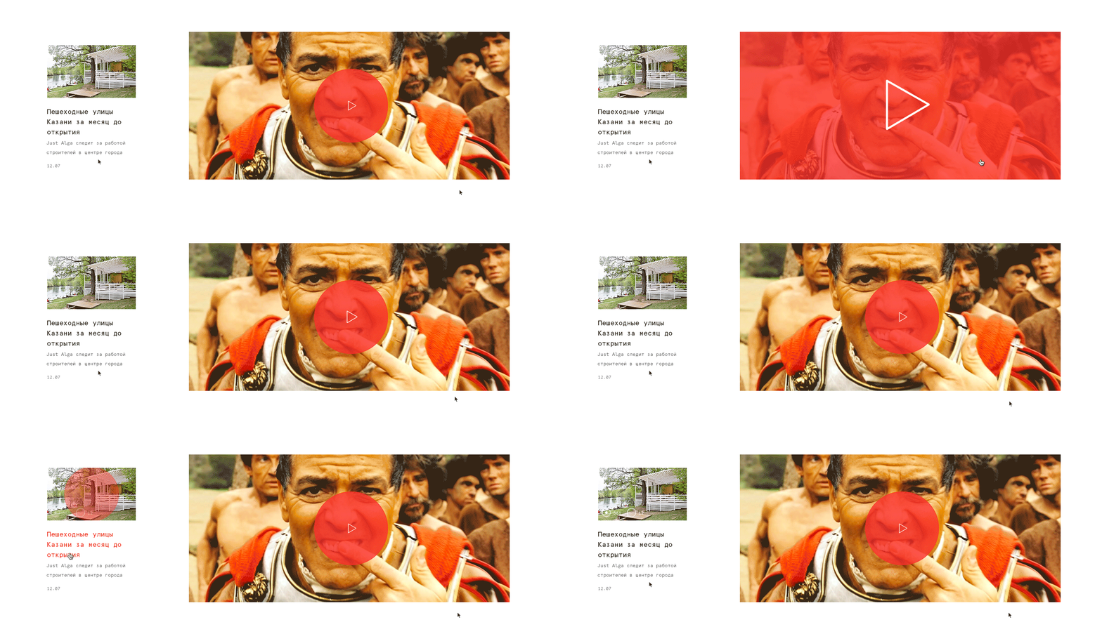
It was critical to launch the new media in just 2 months. That’s why we only included the main features in the web version. As soon as it became available to readers, we started adapting the site for mobile devices.


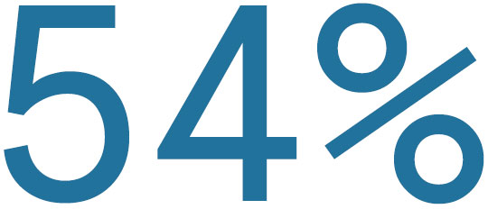
of today’s users surf the internet on their mobile devices. Launching a site without a mobile version is now the exception rather than the rule.
Editor’s super power
We already have 8 cases of new media sites in our portfolio. 8 different editorial teams told us about their needs, pains and dreams. It helped us identify the core features to make them the heart of our comprehensive content management system.
Creating and Editing publications
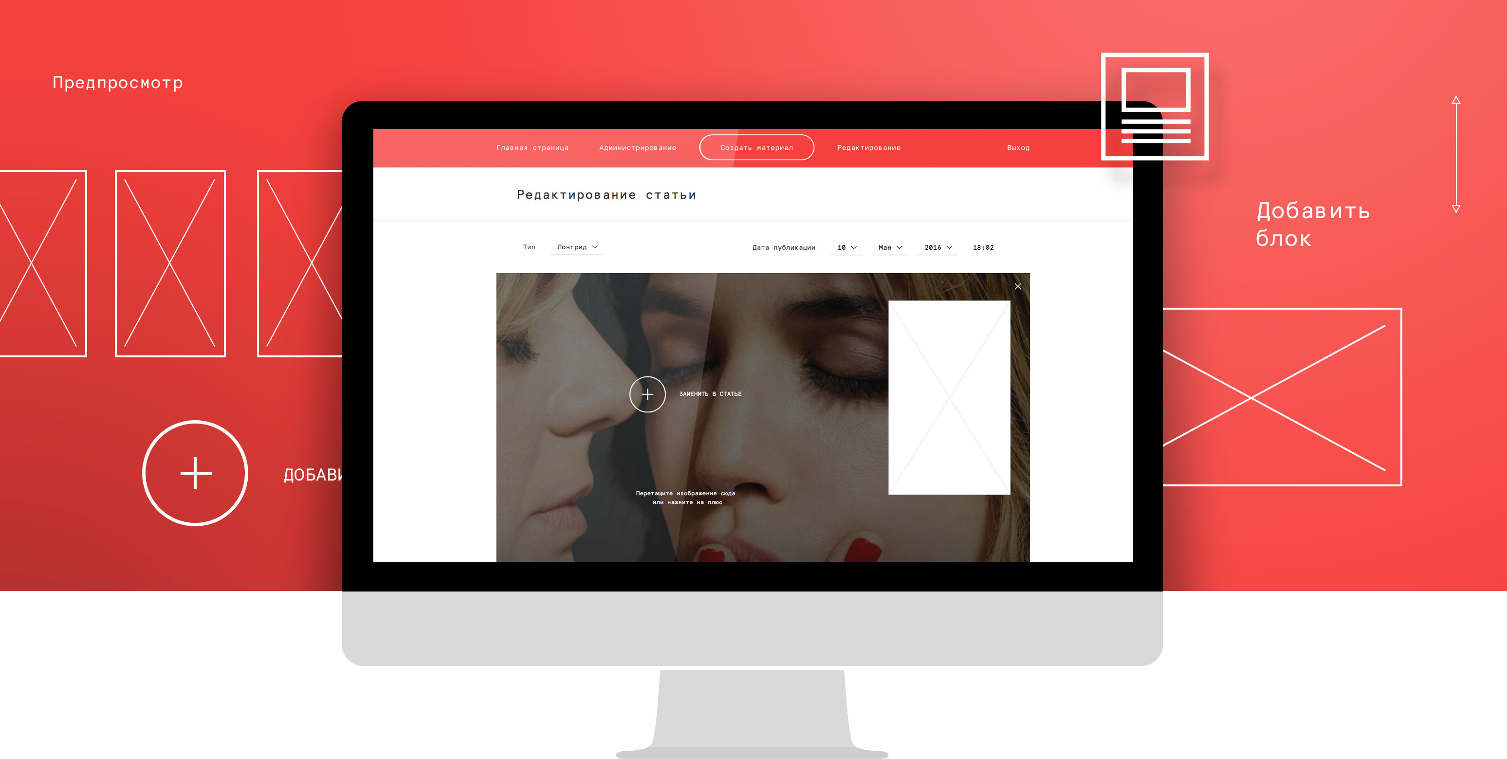
The main feature is the publication system that allows to create magazine style publications. Columns, comments, and recommendations make articles look glossy and attractive.
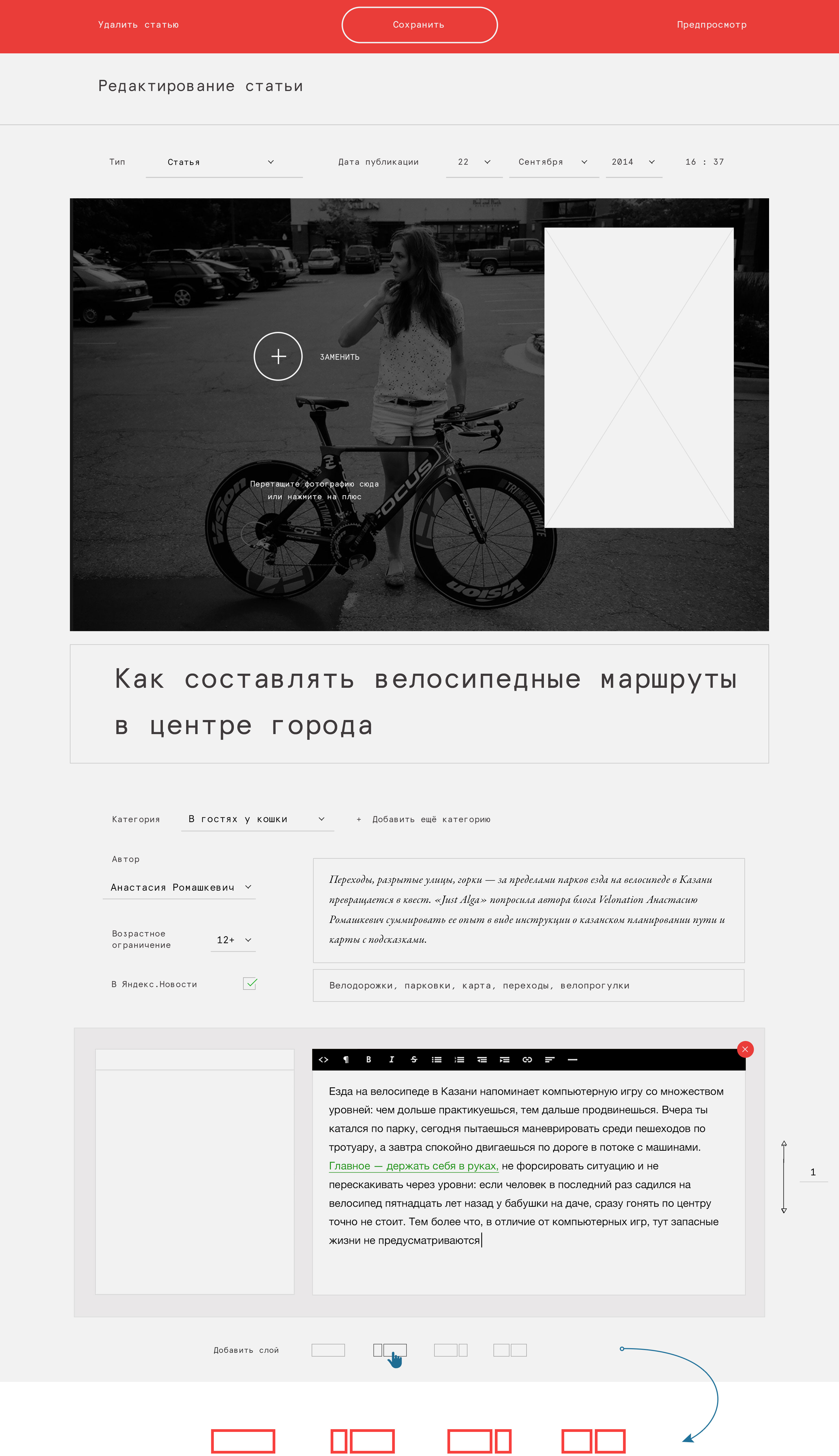
Every new layer in a publication can differ from the other ones giving editors’ imagination free play and making articles lively, full and engaging.
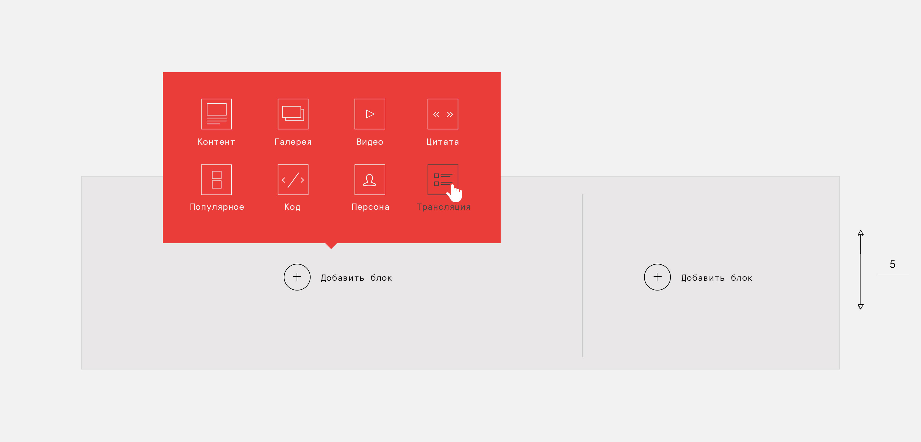
Let’s have a look at the editor’s interface...
... and the way the reader sees it.


Check out the variety of publication layouts:
- longread: Ilya Krasilshchik, publisher at Meduza, shares his thoughts on how to make a good video and win over your audience
- short news article: Theatre lab "City - Art - Preparation" dates announced
- interview: "I advocate Tatar style because I personally like it"
- guides and lists: Where to send your kids this summer. Summer camps guide
- reviews: New place. Craft beer pub "Varka"
- magazine-style layouts: Cannes 2016: what to watch
Features of the content management system
Editorial team has all the tools they need.

Customer review
"We’ve been working with Manufactura since July 2015. Their team built the website of our online magazine Inde from the ground up: they designed it, programmed it and made it mobile responsive. Despite the distance, communication has never been a problem. For instance, we can track the work progress on Trello boards. We synchronized Trello with a separate Slack channel and get notified about all changes on our boards. We had a few disagreements with Manufactura’s designers on the use of fonts, but those type of things are typical in the design process and can be easily solved.
I thank their team for promptness in dealing with our questions and requests. The account manager that works with us is always ready to help, even on her days off.
I particularly enjoy following the founder of Manufactura Dmitriy Provotorov. He created the company where he wanted to work himself and I believe all of Manufactura employees are happy to work there too. This is really cool!"
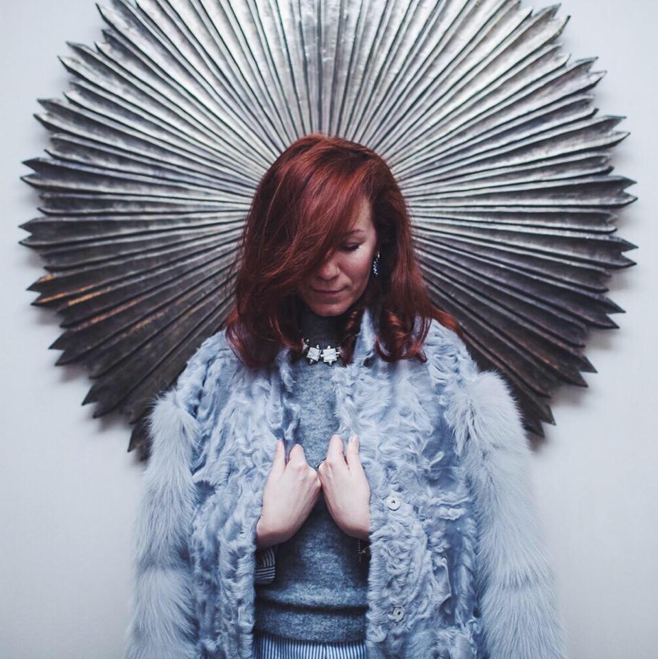
Yuliya Turanova,
Chief Editor, Inde Online Magazine
